
With mobile usage becoming increasingly prevalent in the digital landscape, businesses must prioritize providing a positive user experience on all types of devices. Testing a mobile site is essential for ensuring it performs well and is compatible with smartphones and tablets.
The mobile site testers execute the test process that involves checking and confirming the features, ease of use, and adaptability of a website specifically created for mobile devices. It includes performing multiple tests to confirm the proper functionality of the mobile site on different devices, screen sizes, browsers, and operating systems.
This blog will discover advanced methods and strategies tailored for mobile websites to ensure thorough Quality Assurance (QA). These creative approaches assist companies in enhancing their efforts in mobile site quality assurance and providing outstanding user experiences.
Advanced Approaches for Mobile Site Testing
Here are some of the advanced approaches and techniques to QA for mobile site testing.
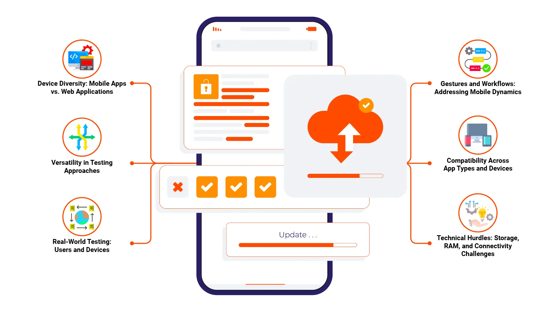
Device Variability
Testing on various devices is crucial because each one has unique characteristics. To cover a broad range of devices, consider the following approaches:
- Real Devices: Testing on actual devices generates more accurate results. You can detect hardware-specific issues like touch sensitivity and screen resolution variances.
- Emulators and Simulators: These tools are cost-effective ways to test on different devices virtually. They allow you to simulate various hardware configurations without owning every device. Emulators mimic device behavior at a software level, while simulators represent hardware behavior.
- Device Farms: Real device clouds offer remote access to various real devices. It can benefit comprehensive testing when you need access to devices you don’t own.
Cross-Browser Compatibility
Ensuring your site works across multiple browsers is critical since users might access your site from various platforms. To test cross-browser compatibility:
- Popular Mobile Browsers: Focus on widely used browsers like Chrome, Safari, Firefox, Edge, and Opera. Each browser has unique characteristics, so test them thoroughly.
- Browser-Specific Features: Look for browser-specific differences in rendering, JavaScript execution, and CSS handling. Some browsers handle certain elements differently, leading to unexpected behavior.
- Mobile Operating Systems: Test on different mobile operating systems (iOS, Android) since they can impact browser behavior and functionality.
Use of Cloud Platforms

Cloud platforms provide scalable infrastructure and flexible resources. Cloud testing accesses various virtual devices and operating systems for comprehensive test coverage. Cloud platforms also establish collaboration among distributed QA teams and allow for integration with Continuous Integration and Continuous Deployment pipelines.
Dynamic Layouts
A responsive site should adjust seamlessly when screen orientation or size changes. Here’s how to ensure smooth dynamic layouts:
- Orientation Changes: Test how the site responds when switching between portrait and landscape modes. Verify that elements rearrange correctly and there are no overlaps or misalignments.
- Breakpoints and Media Queries: Ensure your CSS media queries work as expected. Test each breakpoint to confirm the design adjusts appropriately to different screen sizes.
- Fluid Grids and Flexible Images: These features are fundamental to responsive design. Test fluid grid behavior and ensure images and other media scale correctly with the screen size.
Performance Testing

Performance testing for mobile sites ensures an efficient user experience. As mobile users often have varying network conditions and device capabilities, performance testing requires a comprehensive approach. Here’s an in-depth look at critical strategies for advanced performance testing:
Load Testing
Load testing helps determine how a mobile site testing performs under different traffic conditions. This approach is crucial for identifying bottlenecks and understanding how the site scales with increasing loads. Here’s how to conduct effective load testing:
- Simulate Traffic Loads: Use tools to simulate varying traffic levels. Increase the load to identify the point at which performance begins to degrade.
- Analyze Server Response Times: Measure the time it takes for the server to respond under different loads. This can help you identify slowdowns in your infrastructure.
- Stress Testing: Push the site to its limits to understand its performance under extreme conditions. This can reveal weak points in your architecture or codebase.
Page Speed Analysis

Page speed is critical for mobile sites, as users typically have a lower tolerance for slow-loading pages. To ensure optimal page speed, consider these advanced techniques:
- Use analysis tools to measure your loading time and suggest ways to improve it. These metrics consist of FCP, TTI, and CLS.
- Identify Performance Opportunities: These tools will help you recognize issues such as using huge images, a lot of JavaScript, and ineffective CSS.
- Optimize Critical Rendering Path: Set the priority for loading the pillar resources to get a faster page load from the beginning. Exclude render-blocking resources from the page and use lazy loading for non-essential content.
Network Variability
Mobile users often encounter varying network conditions. Testing under different network conditions is crucial for understanding real-world performance:
- Simulate Network Conditions: Tools like Chrome DevTools and BrowserStack allow you to simulate various network scenarios. Test your site on slow networks to understand its behavior in less-than-ideal conditions.
- Measure Latency and Bandwidth Impact: Analyze how latency and bandwidth limitations affect loading times and user experience. This can help you identify opportunities for optimization.
- Optimize for Slow Networks: Consider techniques like code splitting, caching, and resource compression to enhance performance on slower connections.
Additional Performance Testing Considerations
Here are a few additional considerations for comprehensive performance testing:
- Use compression techniques to reduce the size of resources sent to the client.
- Content Delivery Networks can help distribute content across global servers to reduce load times and server stress. Consider using this network to improve performance for users in different locations.
- Create performance optimizations for mobile users. This might include reducing resource sizes, minimizing animations, and ensuring responsive behavior.
By incorporating these advanced approaches into your performance testing strategy, you can ensure that your mobile site testing delivers a fast and reliable user experience.
Functional Testing

It ensures that all features of a mobile site testing work as expected across different devices and platforms. It focuses on validating user interactions, ensuring accessibility, and leveraging automation for efficiency. Here’s an exploration of the critical aspects of functional testing for mobile sites:
Automated Testing
Automation testing is a powerful way to improve the efficiency and scope of functional testing. It allows for quick iteration and broader test coverage. Consider these advanced approaches to automated testing:
- Framework Selection: Choose a framework that suits your needs. Each framework has strengths and works with various test environments.
- Test Automation: Automate repetitive tests to save time and reduce the potential for human error. This includes functional tests for user flows, form submissions, and other interactive elements.
- Continuous Integration and Continuous Deployment: Integrate automated testing into a pipeline to ensure tests run regularly. This allows you to catch issues early in the development cycle and maintain a high level of code quality.
- Regression Testing: Automated regression tests are essential to keeping track of new updates while simultaneously avoiding breaking the existing working functionalities.
User Interaction
Functional testing must account for the unique ways users interact with mobile devices. Mobile-specific interactions require careful testing to ensure responsiveness and accuracy. Key areas to focus on include:
- Touch Gestures: Test everyday touch interactions like taps, double-taps, swipes, and pinches to ensure they work correctly. Consider different touchscreen sensitivities and device behaviors.
- Long Presses and Context Menus: mobile site testing uses long presses to open context menus or trigger specific actions. Test these interactions to ensure they’re consistent and intuitive.
- Mobile-Specific Navigation: Test navigation elements to ensure the traffic is managed and fully functioning. Take measures to guarantee that the site’s visitors can quickly go from one section to another.
- Form Input and Validation: Test form elements like text fields, radio buttons, checkboxes, and dropdowns. Ensure that input validation works correctly and provides helpful feedback to users.
Accessibility
Accessibility is one of the factors of functional testing, and it is usually indispensable. It helps your mobile site testing be functional and accessible to all users, including those with disabilities. Critical considerations for accessibility testing include:
- Apply guidelines such as Web Content Accessibility Guidelines to ensure conformance. This guideline includes a set of accessibility requirements that are spread over several parameters, including text alternatives and keyboard navigation.
- Test your mobile site testing with screen readers to ensure that all content is accessible to visually impaired users. It includes testing for correct reading order and proper use of ARIA attributes.
- Check that the users can navigate through the site provided they simply use the keyboard, other tactile devices, or any other assistive gadget. It contributes to a user-friendly interface for people who cannot move.
Usability testing

Mobile site usability checks guarantee that customers of a site can avoid a complex or distracting environment while navigating. A great user experience usually pushes visitors to spend more time on the site, increasing engagement and conversion rates.
User Experience Research
User experience research involves studying how real users interact with your mobile site. This approach provides valuable insights into user behavior and can guide usability improvements. Here are some effective methods:
- Usability Studies: Conduct usability studies where participants perform specific tasks on your site. Observe their interactions and gather feedback to understand pain points and areas for improvement. This hands-on approach can reveal unexpected usability issues.
- User Tracking Tools: Tools like Hotjar, Crazy Egg, or UserTesting let you monitor the site journeys and user interactions. Hotspots, user sessions recording, and mouse clicks monitoring are as a drop-down list.
- Surveys and Feedback: Collect feedback from users through surveys or feedback forms. Ask specific questions about their experience to identify common issues and suggestions for enhancement.
Navigation and Layout
An intuitive navigation and clear layout are crucial for successful mobile site testing. Advanced usability testing ensures that users can find information quickly and navigate the site without confusion. Consider these aspects:
- Navigation Structure: Test the site’s navigation to ensure it’s straightforward and logical. Verify if it is easy and quick for the users to locate menus, buttons, and other navigation components.
- Mobile-Specific Navigation: Make sure the mobile-specific navigational elements, including hamburger menus and swiping gestures, are as expected. Test transitions between sections to ensure they are seamless and intuitive.
- Consistent Design: Consistency in design elements like colors, fonts, and icons is essential for usability. Ensure these elements are uniform throughout the site to avoid confusion.
Conclusion
In conclusion, You can deliver a comprehensive mobile site testing framework by integrating these advanced approaches into your QA strategy. It ensures that your site meets the demands of modern mobile users and provides a reliable and high-quality experience.